Estimating Restaurant Workloads with Box Plots

Previously, I had posted on using box plots to estimate portions for kitchen prep.

In addition to estimating portions, a restaurant needs to anticipate how to staff each shift. As was the case with kitchen prep, box and whisker plots can help for staffing. By looking at the range of orders for shifts, you can estimate ‘how busy’ things might be. And by looking at net revenue, staffing requirements can be balanced with the cost of a higher head count.

Restaurant box plot - estimating workload

Restaurant box plot - estimating workload

Unsurprisingly, Saturday evenings are the busiest and generate the most revenue. However, there is a wide range both above and below the median. You will want to staff more than other days, but how much? Depends on what you consider the greater risk. 1) Not having enough staff, and negatively impacting service and potentially repeat customers. Or 2) Being overstaffed and cutting into margins. (Or worse, cost exceeds net revenue.)

On the other hand, the range is quite narrow on other days, so estimating staff requirements will be easier. And Sunday is between the two extremes. Not as great a range as Saturday night, but still greater than weekdays. Unlike Saturday, the range is bottom heavy. (Data points are closer below and more spread out above. In this situation you can hedge your bets by sticking between the bottom and middle of the range.

Restaurant Kitchen Prep

How does a restaurant decide how many brussel sprouts portions to prep for any given shift? Prep too many and food gets thrown away, increasing costs. Prepping too many results in increased ticket times, which impacts service. Customers develop a negative impression as their orders are delayed.

Visualizing point-of-sale (POS) data can show historical purchase data to more accurately estimate needs. The box and whisker plot can display the variation in orders during different time periods. The box plot below shows how many brussel sprout portions, whether for a stand-alone order or as a side, were required for the morning and night shifts on each day of week.

Daily portions box and whisker plot for kitchen prep

A box plot provides more than simply looking at averages, which can be skewed by outliers. The bar portion of the graph shows how many portions were needed half the time. The center of the bar (where the color changes) shows the middle (median) portions needed. The bracket shows the top quarter and bottom quarter portion needs. By looking at the middle point and how far the box-and-whisker stretches from the middle, you estimate whether the portions required are more likely to be the lower quantities or the higher ones.

From this example, more of the shifts are bottom heavy. In these cases, it might be best to prep for a quantity around the median value. The Sunday morning shift, however, splits down the middle and covers a wide range. Whether you go with the lower or higher value depends on whether wastage or increased ticket times is of greater concern.

Another bit of information the box plot can provide are outliers. These are the data points that fall outside of the box and whisker. In this plot the Saturday night shift are all outliers, making it difficult to estimate the correct portion to prep. In this case, you might try looking at a plat that includes more POS data.

Restaurant Forecasting

Toast has a great blog that covers the many ways that you can use sales data to make business decisions. For example, there’s this article about sales forecasting https://pos.toasttab.com/blog/restaurant-sales-forecast

The article describes how you might calculate sales based on capacity and average revenue from a main dish. This is a good way to get an approximate idea of sales for busy times and quiet times.

However, you have many different dishes at different price points/profit and sales can fluctuate based on many variables, aside from busy and not busy time/days. There exists a statistical analysis that can help!

A regression analysis takes into account many different variables: time, day of the week, nearby events in the area, whatever you think is relevant and important. After you feed a bunch of data from your sales system (Toast or other) into this sort of analysis, you can get an idea of how these variables impact sales. Knowing that you can get an even more precise forecast of sales and for inventory, as well!

So for example, this analysis might say that Sundays result in $1000 more sales than weekdays and when there is an event at the local theater that will be $2000 more in sales but if it’s February that will be $500 less and so forth. You can than make some more precise (but not perfect!) forecasts for sales.

And you can do it on an menu item level—what sells when, given the above variables. And with that forecasting information, you can optimize inventory. If you know how much is selling when, you can order accordingly.


Designing the Most Effective Menu

With the importance of online ordering and the challenge of reduced capacity, you might want to simplify your menu by highlighting your popular and most profitable items. With toast tab and other systems, you can pull data to identify those high margin items that are contributing the most to your profit.

Graphically, those items could be charted:

Top Profit Items.png

All items are neatly ordered from most profitable to least profitable items. You could just remove low profit items and keep the high ones.

But you could miss some opportunities to maximize profit.

A matrix-based analysis could uncover those opportunities and drive menu item and marketing decisions. This analysis was first popularized by the Boston Consulting Group (BCG) for corporate product manages. Many variations have since been applied to different entries, including menu design.

The Toast blog talks about menu design using this concept.

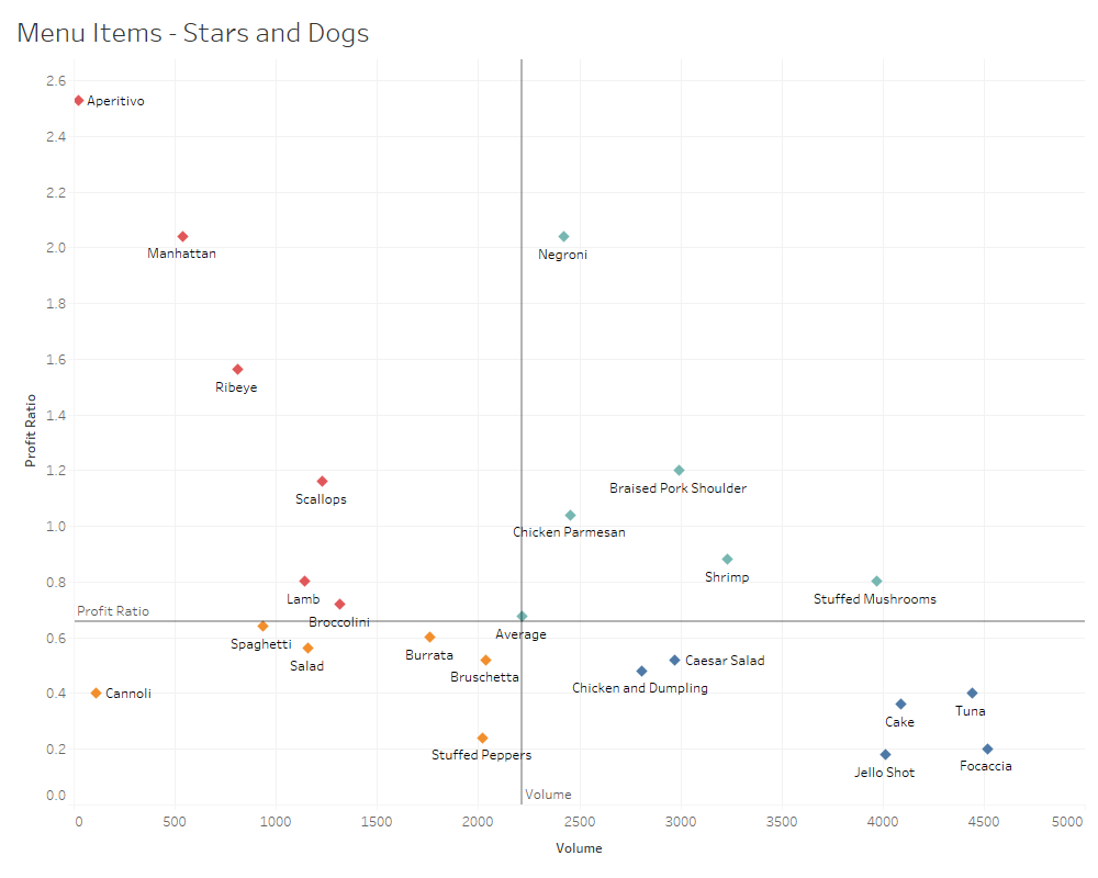
A menu item matrix would something like the graphic below (based on random data for illustrative purposes).

Profit Volume Matrix.png

Each section of the matrix represents a category of menu items.

In the upper right are your star items. If your online ordering platform allows you to feature items at the top of the page, these items would go there.

The lower left are the dogs (low volume, thinner margins). These are candidates for dropping from a simplified menu. But be careful that you don’t remove items that are favorites of your regular customers that are also purchasing more profitable items.

The other quadrants are where you might find some of the opportunities for more profit. As an example, you might look at the high profit ratio/low volume items and pair them with a star to increase sales. A cluster analysis (explained here) of orders and similar analyses can show you what menu items are already being ordered together. These sort of analyses can also provide insight into your regular customers and their profitability.

A menu item matrix can be a powerful decision-making tool to makeover or simply tweak your menu to be more effective and driving more profit.

See also

E-Commerce Analytics for Pubs, Bars, and Restaurants

Now more than ever digital ordering has become a crucial stream of revenue. The dramatic increase take-out and delivery of food and drink has resulted in an overwhelming amount of information and data. It’s become all the more important to make sense of online sales data to shape the online menu that will deliver.

A platform like toast tab offers information (what’s being ordered by who) that can provide useful insight if you know where to look.

As a start, it’s great to be able to see what menu items and categories are performing well. You’ll want to promote those. And it’s easy enough to see what menu items are performing well versus others; however, if you can identify combinations performing well, you can create bundling specials and promote them. Applying certain statistical techniques to the Menu Item Details report can give you that. Your best combo might include an item that doesn’t excel on its own!

For example, you might identify a group of customers that like the house beer paired with a particular burger and side. You can bundle and promote that combo in your Toast menu. Perhaps, offer special pricing for that combo.

Likewise, you can figure out the tap line-up based on the revenue from orders that include specific beers, rather than how beers hold their own. You might generate more revenue from a beer that sells at a lower volume if customers often purchase that beer with another menu item.

Some restaurants and pubs have started offering subscription-based fulfillment, similar to HelloFresh or Blue Apron, except it’s a theme relevant to the establishment. It could be coffee, pasta, beer—any number of things. By digging into the analytics, you could possibly identify subscription packages: this coffee with this pasta and this desert, for example.

User Testing Can Help Your Online Menu

You can’t have your full menu available for digital ordering. So what food, beer, wine, cocktails do you offer? One approach would be to try some items out—whatever you think might work well—and then track the results and tweak the menu according to what is going well and what is not.

That would be a good approach, and you could do more. What would that initial menu look like?

You likely have some good intuition based on your experience. What if you could validate that intuition before releasing? Software companies often use data analysis to figure out what product users would most likely purchase. In many consumer industries, testing is used to identify product configurations that are more likely to succeed than others.

A menu is essentially a product line. Each food and drink item on the menu have different attributes like a product.

One approach, conjoint analysis, can help identify what users may prefer as a group. Not just do I prefer mayo over mustard. But given several options, one group of your customers would rather have a hamburger with mayo and a side of fries over a hamburger with aioli and a side of tater tots. Another group prefers an impossible burger with pickles and a side of sweet potato fries over a bean burger with pickles and a side of tater tots, etc.

What combination of items do large numbers of your customers prefer?

You can find a good starting point through surveys and online focus groups.